UI/UX Design
Branding
Copywriting
About this Project
The goal is to visualize the experiences of CN students among SLBs in an interactive way so that SLBs can show enough understanding of CN students to adequately support them during their studies.
Background
Currently, there is no essential platform within the HHS that enables SLBs to inform themselves about the experiences and problems faced by Caribbean Dutch students. The lack of this platform results in teachers not being able to provide the necessary help and support to this specific group of students. The focus is on the SLBs because they are the first point of contact for students at HHS.
The client
The client of this project is Lectorate Inclusive Education project CarE.
CarE is based on the principle of inclusiveness and seeks to address the challenges faced by Caribbean Dutch students in higher education.
The project aims to create an inclusive learning environment where all students, regardless of background, have equal opportunities for academic success.

Empathize
During the research phase of the project, the focus is on investigating the target group of CarE and looking for inspiration on interactive elements. This will consist of conducting interviews with the target group (teachers) and the engaged group (CN students) to gain insight into
1.) CN students' experiences and expectations regarding their SLB teachers, and
2.) to gain a deeper understanding of the experiences, challenges, mentoring relationships and insecurities of my target group, the teachers, regarding teaching and mentoring CN students.
Using the affinity diagram method, the information gathered from the interviews will be analysed and used to create user needs.


User Needs
After analyzing the research of both the target audience and competitors, and answering the research question. I wanted to take the following points, rewritten as user needs, into the concepting phase.

Ideate
During the concepting phase, I used the technique card-sorting with the clients to come up with concepts. I also used the creative direction technique to create a visual design for Project CarE and presented it to the clients so that a visual image would be captured at the prototype stage.
Card-sorting
We started by collecting all user needs in FigJam. In a joint brainstorming session with my clients, we initially identified overlapping user needs and grouped them into clusters. Together, we created categories for these clusters and formulated clear definitions for each category. We then rated the categories according to their priority, putting the most demanding needs at the top.


The Concept:
The concept focuses on developing a platform that focuses on building empathy and supporting capabilities of CN students for SLB teachers at HHS.
The platform includes various stories and perspectives of CN students highlighting their study experiences in the Netherlands, starting from their arrival to graduation. These stories mark milestones that allow users to receive an interpretation at the end of each stage. This clearly highlights what these experiences mean for the students. With the interpretations, users can also receive possible support options and available resources to strengthen their knowledge about the students.
Visual Styling
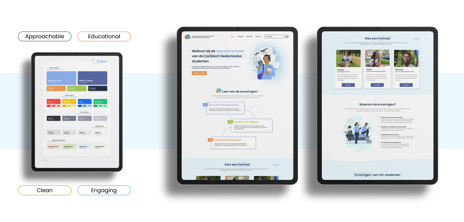
Based on the problem of the absence of a visual design for the project and clients being unsure whether they wanted to use CarE's corporate identity in full or use different colours after all.
I first researched the psychology of colours to see which colours have an educational appeal. The research showed that blue, green, orange, purple, yellow and red can give an educational feel. Together with clients, we decided not to look at and use red and yellow.
Since the main colours of CarE are blue and green, I then started looking at purple and orange and applying them as accent colours alongside the main colours, so that CarE would still remain under the spotlight.

Style Guide
Once the concepts were presented and one was chosen, I created the style guide for the chosen concept. This was the concept with orange as the accent colour.

Prototype
During this phase, I start working on the concretization of the online platform for project CarE. The chosen concept and use of colour, which come from the ideation phase, now guide the further development of the project.
Wireframe
The primary objective of the platform is to provide users with access to the migration narratives of Dutch Caribbean students. Our central focus lies in enhancing readability, fostering engagement, and cultivating empathy among our audience.
This emphasis on accessibility and connection is reflected in the strategic placement and introduction of the initial sections on the homepage, ensuring that users are immediately drawn into the stories and encouraged to explore further. By prioritizing readability and engagement, we aim to create a space where users can immerse themselves in the experiences and perspectives of Dutch Caribbean students, fostering a deeper understanding and appreciation of their migration journeys.

Hifi-Prototype
Using the pre-made wireframes, I started with the hi-fi prototype. While designing the hi-fi, I experimented the most with the use of color.
To evaluate the initial version of the high-fidelity (hi-fi) prototype for ambiance, I collaborated with three fellow experts and one of our clients. The purpose behind this evaluation was to assess the alignment of the concept with its intended attributes. To achieve this, I conducted a validation test focused on the use of color. By involving both experts and clients in the evaluation process, we aimed to gather diverse perspectives and insights to ensure that the prototype effectively communicates the desired ambiance and meets the project objectives.

During the evaluation, the three fellow experts and the client expressed concerns regarding the abundance of colors featured on the homepage. They believed that this approach did not align with the desired attributes of being clean, engaging, approachable, and playful. Furthermore, they felt that the chosen colors lacked vibrancy, making the overall design appear somewhat dull. Based on this feedback, there was a consensus to shift the design focus towards incorporating more shades of blue to better reflect the desired aesthetic and enhance the visual appeal of the platform.
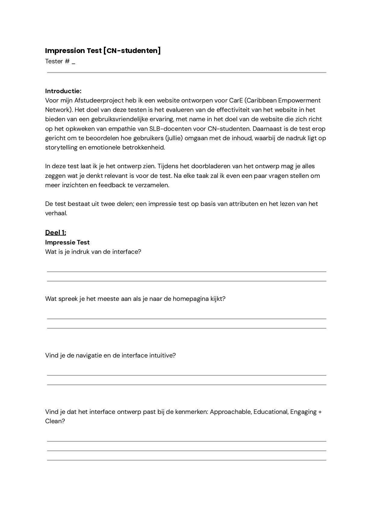
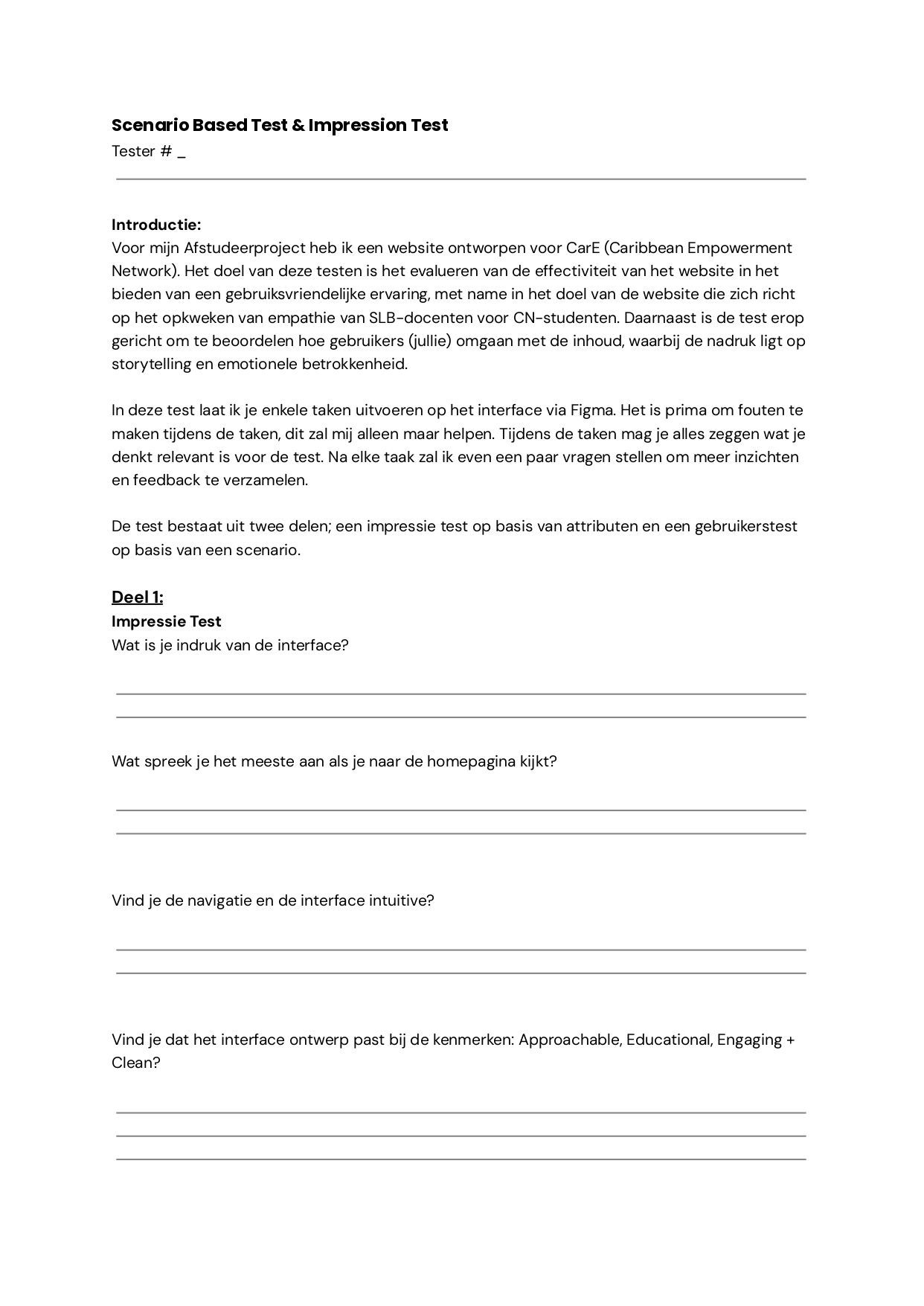
Test
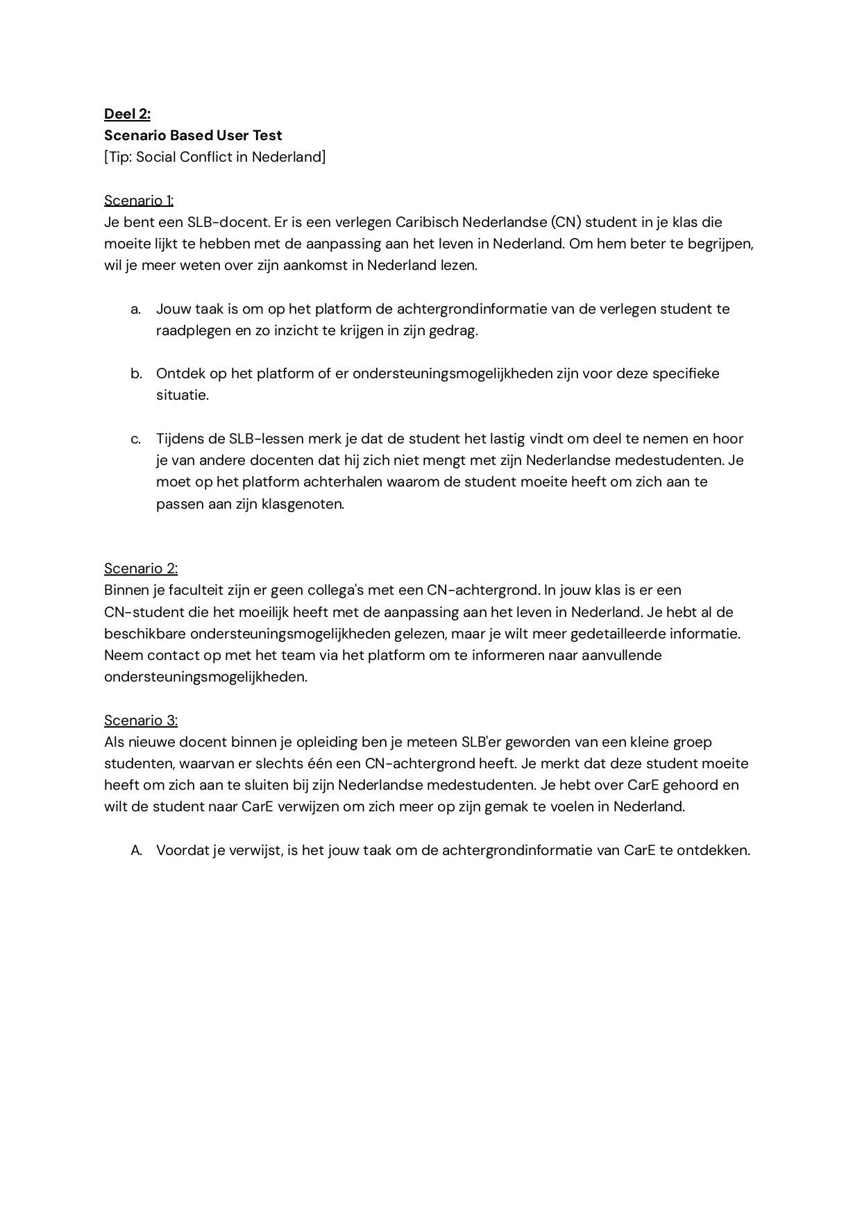
To assess the platform comprehensively, I opted to conduct two distinct tests. Firstly, I conducted a usability test with the primary users, who are teachers also serving as SLB'ers, focusing on evaluating the platform's atmosphere, usability, and content from their perspective.
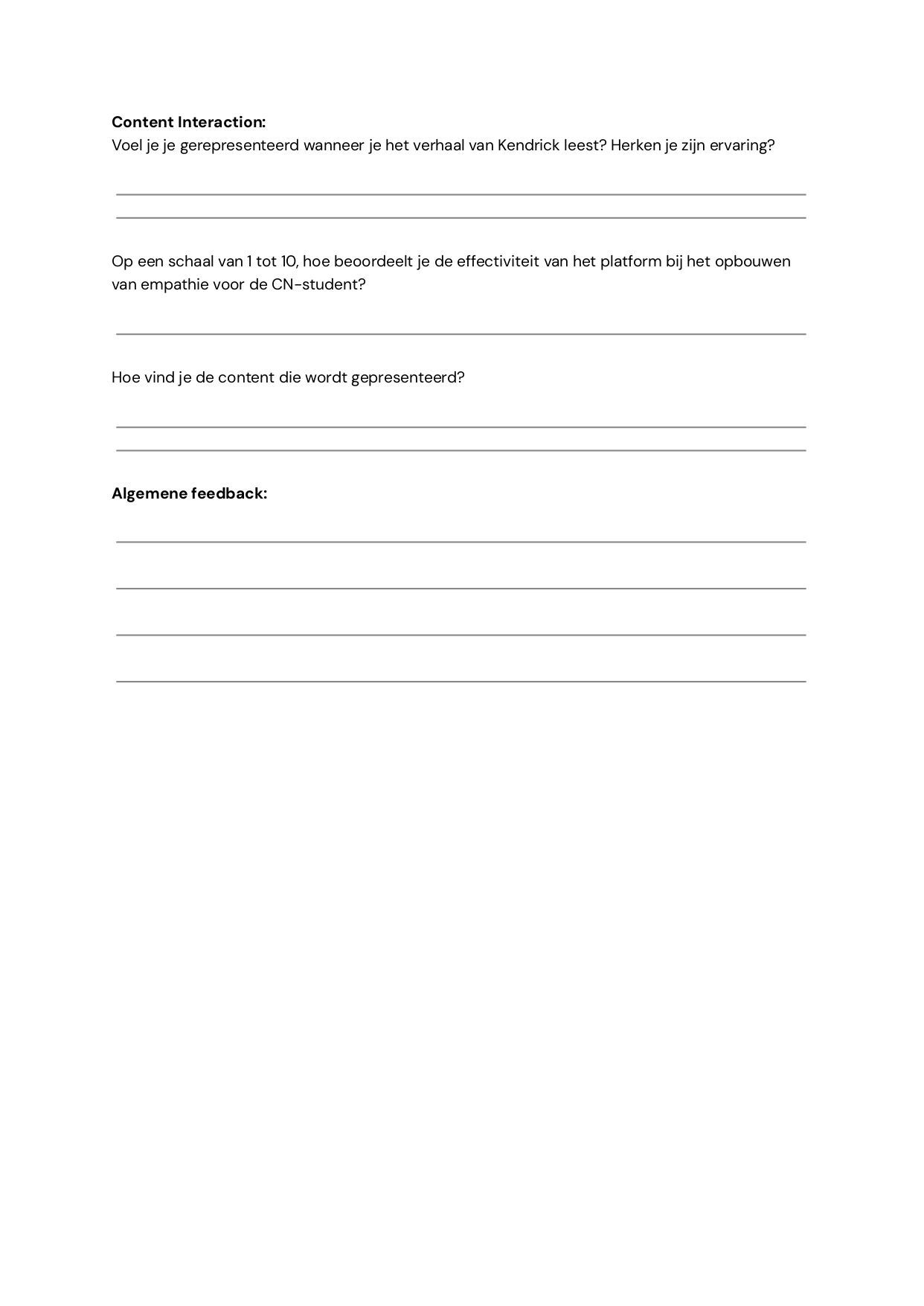
Additionally, I conducted an impression test with CN students. This test focused on evaluating the platform's atmosphere and story content to gauge their sense of representation while reading the stories and to gather their feedback on the overall platform experience
User Based Testing
First, I had tested the hi-fi prototype with 3 CN students to understand their thoughts on the platform being developed for them. I had 2 students whom I had interviewed in the empathise phase and 1 student who did not know about the project.
User Based Testing
After I finished testing with the CN students to understand their thoughts on the platform. I started testing the platform with the teachers.
After incorporating the feedback and making necessary revisions, I am pleased to present to you the finalized Hi-fi prototype;


Dive into our innovative platform, meticulously designed to empower you in guiding and nurturing CN students, ensuring their success every step of the way.
